Responsive Assets Company
As a responsive assets company, Global Matrix Solution offers top-tier website design services focused on responsive design to ensure your digital assets perform across all devices. Our skilled web developers provide custom web solutions with the latest technologies, including AI development and mobile app development, to enhance functionality and user experience. We support digital transformation with services such as cloud computing solutions and e-commerce solutions, while also incorporating robotic process automation (RPA) to streamline operations. Our UI/UX design creates intuitive interfaces, ensuring your business stays competitive in today’s digital world.
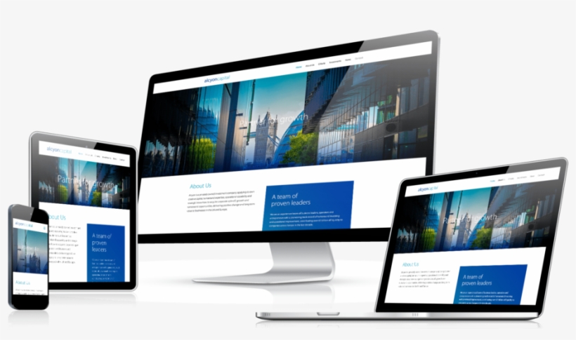
Responsive Assets: The Future of Seamless Web Design
The website is made to give you access to the most recent information. Web designers are testing this approach to make browsing and reading on the web simpler. The website does not require constant resizing, panning, and scrolling if it was created using the responsive web design methodology. Smartphones, tablets, and computer monitors are all simple to operate. Google recommends responsive websites, but what other marketing materials really need to be responsive? We all know the solution is the growing number of mobile users. In a nutshell, responsive web design is the future of the virtual world. As more consumers rely on mobile devices for shopping, browsing, and interacting with brands, having a responsive design is crucial for staying competitive. It ensures a seamless experience, boosts user engagement, and contributes to better search engine rankings. This approach not only future-proofs your website but also adapts to the ever-changing landscape of digital interactions.
Responsive Assets Solutions
We Offer
At Global Matrix Solutions, we specialize in providing responsive asset solutions designed to enhance user experience across all devices. Our services focus on optimizing the performance and accessibility of digital assets, ensuring seamless interactions on mobile, tablet, and desktop platforms. Whether you need custom app development, web design, or responsive SEO strategies, our team is dedicated to delivering solutions that adapt to the ever-evolving digital landscape.
Responsive Web Design
Responsive web design ensures your website adapts seamlessly to different screen sizes, offering a consistent user experience across desktop, tablet, and mobile devices.
Adaptive Image Solutions
Adaptive image solutions automatically adjust image sizes based on device type and screen resolution. This optimizes loading speed and visual clarity.
Mobile-First Assets
Mobile-first assets are optimized for mobile devices before considering larger screens, prioritizing user experience and ensuring quick load times.
Flexible UI Elements
Flexible UI elements adapt to different screen sizes and orientations, ensuring ease of use and enhanced accessibility across all devices.
Media Queries for Responsiveness
Media queries allow CSS styling adjustments based on specific device characteristics, ensuring assets are displayed correctly across all devices.
SVG Assets
SVGs are resolution-independent and scalable, ensuring graphics look sharp on any screen and contribute to faster loading times.
Responsive Video Solutions
Responsive video solutions dynamically resize videos for optimal viewing on any device, ensuring high-quality playback and faster loading times.
Cross-Browser Compatibility
Ensuring responsive assets work consistently across browsers guarantees your content looks great and functions smoothly for all users.
Best Web Development Company
As the best web development company, we specialize in creating tailored websites that meet the unique needs of your business. Our team of expert developers uses the latest technologies to build responsive, high-performing websites that offer an exceptional user experience. We focus on seamless functionality, ensuring your website works flawlessly across all devices. From eCommerce platforms to custom web applications, we deliver innovative solutions that drive growth and maximize ROI. Our approach includes comprehensive SEO strategies, ensuring your website ranks well on search engines. We also prioritize security, performance optimization, and easy-to-use content management systems. Whether you’re a startup or an established business, we create websites that enhance your online presence and support your goals. Let us bring your vision to life with cutting-edge web solutions.
Get Premium Responsive Design Services
HOURS OF WORK
SATISFIED CLIENTS
PROJECTS DELIVERED
AWARDS WON
To receive the best responsive asset solutions, contact us today.
Based on your unique requirements and desired level of service, our talented and experienced reactive asset developers take great care in building each project to meet your exact specifications. Whether you need responsive web assets, mobile-friendly designs, or custom solutions, we work closely with you to bring your vision to life. Get in touch with us immediately to discuss your needs, and we’ll ensure that every detail is addressed. We focus on delivering user-friendly, visually appealing assets that look great and perform flawlessly across all devices, from desktops to smartphones. Our team is committed to providing a seamless and efficient development process from start to finish, ensuring that your project is completed on time and to the highest standards. Plus, with our ongoing support and maintenance, we’re always available to assist you as your needs evolve, helping you stay ahead in an ever-changing digital landscape.